Stop lettering
Stop lettering
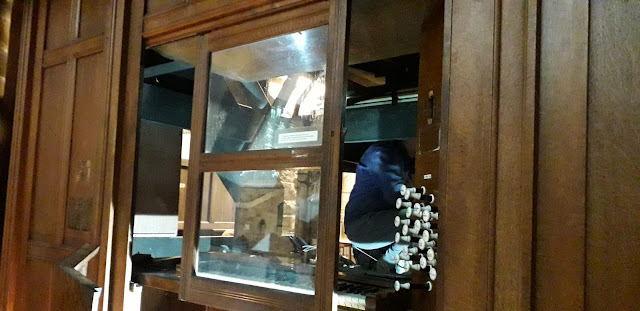
I’ve already told you about all my lovely new pipes, and how my console once again looks (almost) as it did 109 years ago
But I’ve not said anything about any new stop-heads on the console, so what has happened?
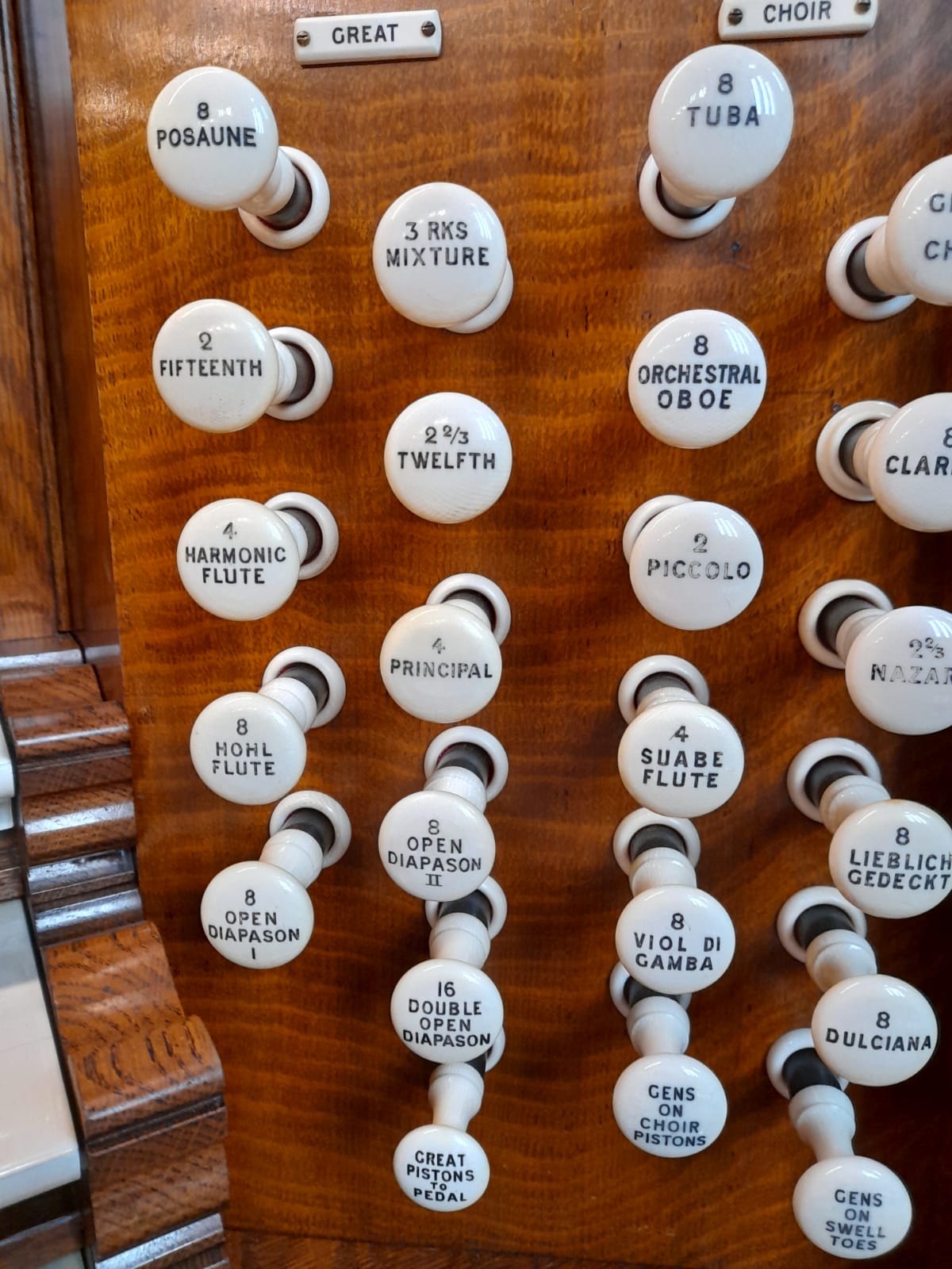
Back in 1911, Mr William had to leave out many important pipes. For 109 years I’ve been incomplete. But he did leave stumps in the right place on my console jambs for the missing stop heads when added at a later date, but I have to say this did look a bit ugly
Mr William’s foresight has helped Mr Gary and his men, for the stumps have become new shanks, with new stop heads telling my organists what to expect when they are pulled out
But the questions they had to answer were these. What style of lettering should be used on my new stop heads? Should my more faded 1911 stop heads be re-engraved? Should Mr William’s spelling of my stops remain, or become more modern
The answer to all of this was not to change anything that didn’t need changing. The lettering style used in 1958 should be kept (can you see the slopey lettering of “to” on two coupler stop heads? Mr William’s fading lettering should be touched up, but no more. New stops should be in the same style. Mr William’s odd spellings should of course be preserved - can you see two examples from the pictures I’m attaching?
My lovely friends, what you now have is my history told through close examination of my stop heads - dear organists, it’s something to think about during particularly long sermons. Its just as the story of my Abbey can be seen in its stones. You can tell which were original stop heads, and which are later additions
Final thought today - is this all too pernickety and obsessive in detail………………………………does any of this matter when you have such wonderful sounds and such a beautiful 109 year old console to look at?


Comments
Post a Comment